
The Flower Exchange

A local flower shop gets a new look for their responsive ecommerce website.
Details
Project Type - UI/UX Design
Role - End-to-end Designer
Client - Student Project
Tools - Figma, OptimalSort, Miro, Whimsical
Project Overview
The Flower Exchange is a family-owned floral business that serves the North Texas area. Just looking at the businesses’ google reviews, customer service and quality arrangements are why customers keep coming back. Essentially for almost any occasion, the Flower Exchange is truly there to fulfill the needs of their customers. With a wide age range of customers, orders come in through a mix of phone calls, often from older folks, and through online orders, usually from people under 40. Though the Flower Exchange is known for its quality arrangements and customer service via Google reviews and word-of-mouth, its website could do a better job of reflecting that information. The website’s aesthetics are not cohesive either and could use some adjustments to reflect the friendliness of the business’ brand.
My contribution
As the only designer on this project, I had complete control over every aspect from start to finish. Being the first of three capstones completed within UX Academy, this project was produced on a similar timeline to previous projects but was done within the constraints of 80 hours. With this project, my goal was to essentially understand what customers value (and don’t) out of the Flower Exchange’s website and personal brand and create a responsive website based off of that feedback. Throughout my research process, I learned that the mobile shopping experience held a high level of importance within this project due to learning more about the website’s customer base. With that in mind, I was able to create a responsive website for the Flower Exchange.
Process Overview
Competitive Analysis
User Interview
Persona
Research
Card sort
Site map
Information Architecture
Task Flow and User Flow
Responsive Wireframe
Sketches
Low-Fi wireframes
Interaction Design
Branding
UI Design
UI Kit
UI Design
Hi-Fi prototype
Usability findings
Affinity map
Iteration and Implementation
Research
Within this phase, my goals were to understand…
What is valuable to the customer about the Flower Exchange online experience.
The process that customers take to order flowers.
Why customers want to order flowers online.
What other clothing floral shops do well online.
The Flower Exchange’s pain points so far.
User Interview
In order to better understand customers’ online shopping habits and preferences, I conducted 3 contextual inquiries in order to observe customers shopping online and ask users firsthand what their experiences/impressions are with the Flower Exchange website. By doing this, I hoped to identify current pain points and strengths with the website to better create a plan of action. Choosing to conduct contextual inquiries instead of user interviews was a better research alternative since I was able to ask users about the site right after having interacted with it.
Competitive Analysis
Accessible social media links and easily accessible contact info were some strengths of the Flower Exchange’s competitors.
A consistent weakness between the Flower Exchange and its competitors was that most of their websites looked very “cookie cutter” in the way that most of them shared not only the same structure of information architecture but design style.
“About me” pages that showed the personality of the brand set apart themselves from other sites.
Sites that made delivery information more accessible and had easily navigable footer and navigation bars also stood out.
Findings:
Needs
To easily have access to the florist’s contact information
To know whether the florist can ship to their zip code, the earlier in the process the better.
To know whether or not this florist is trustworthy.
Reviews/testimonials can help with that.
Enough information on the About Me page can also help.
A clean and professional-looking website also is important.
Frustrations
“Deal of the day” promotion, which is often purchased by customers on the phone, wasn’t visible to the customer on the website.
Products from unrelated categories were mixed together.
Motivations
To find the desired floral arrangement in a quick and efficient way.
To find a floral arrangement that is affordable.
To find a floral arrangement that is quality.
Persona
Based on the user research, a user persona was created to gain a cohesive understanding of the Flower Exchange’s target audience. The user persona is Gerard, a busy professor and caring brother in his 50s who has a need to order flowers when his brother unfortunately becomes injured. This persona is based on one of the Flower Exchange’s target audiences which was established after an interview with the small business’ owner.
Information Architecture
During this phase of research, card sorting tests were sent to 3 subjects to determine how to best sort information within the website, specifically for the navigation bar. These card-sorting tests were conducted using the OptimalSort Card Sorting program. After that, a site map was created based on that data. Customers can search for flowers through the “Occasions,” “Flowers,” or “Bestsellers” tabs to easily find the bouquet that fits their specific needs.
Interaction Design
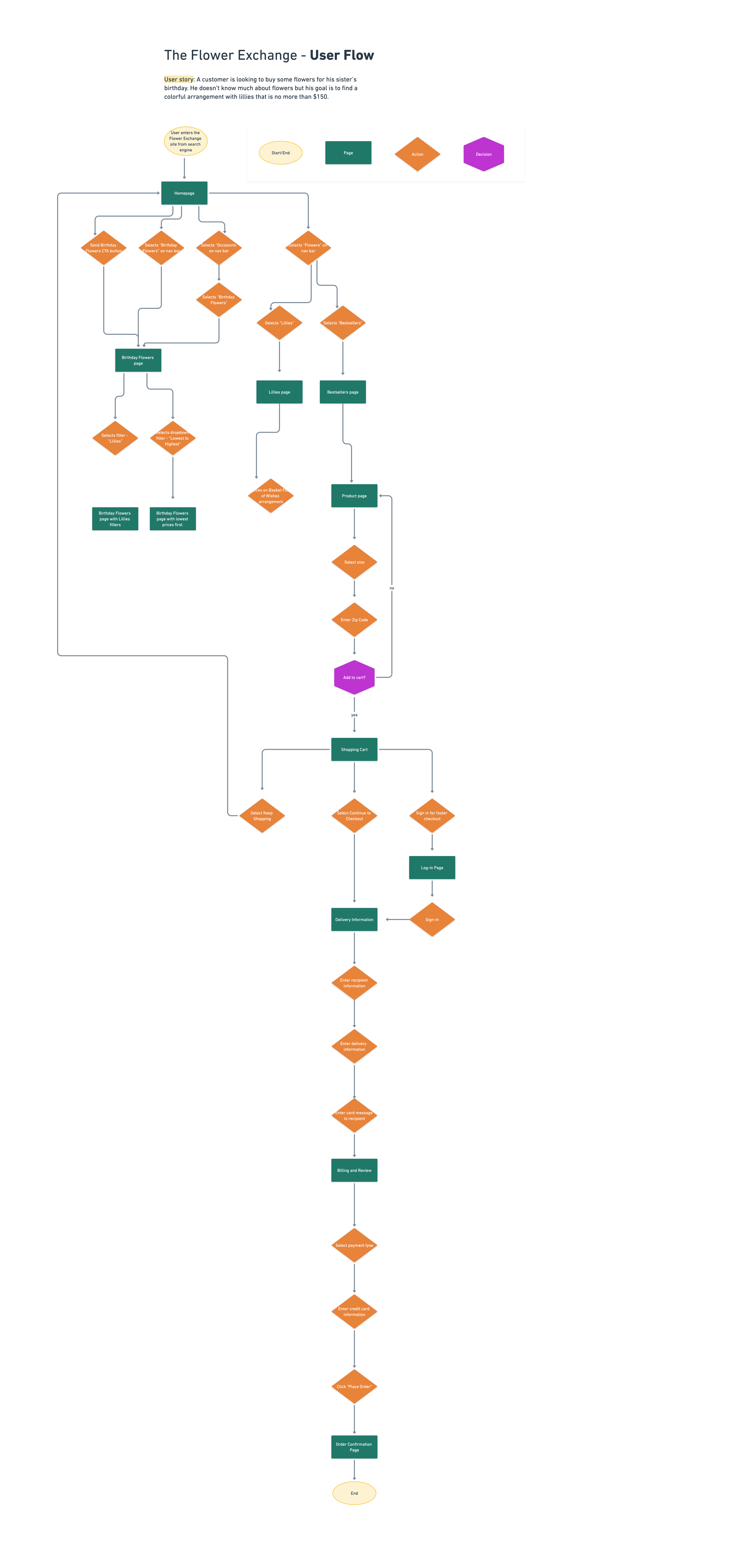
Task Flow & User Flow
A task flow was created to understand how a user may use the website to accomplish a task. This task flow illustrates the actions a customer would potentially take to purchase a floral arrangement for their partner’s anniversary. This particular task flow is emphasized since it relates to the purpose of the website: to order a floral arrangement.
A user flow was created so that I could map out how a user would complete tasks on the website and ensure that the website’s flow is simple. This user flow is based off of the situation in which a customer is looking to purchase a floral arrangement for his sister and needs help finding which specific arrangement to order.
Sketches
In these homepage sketches, I experimented with different layouts to best determine which information needed to be prioritized before I started digitizing the homepage.
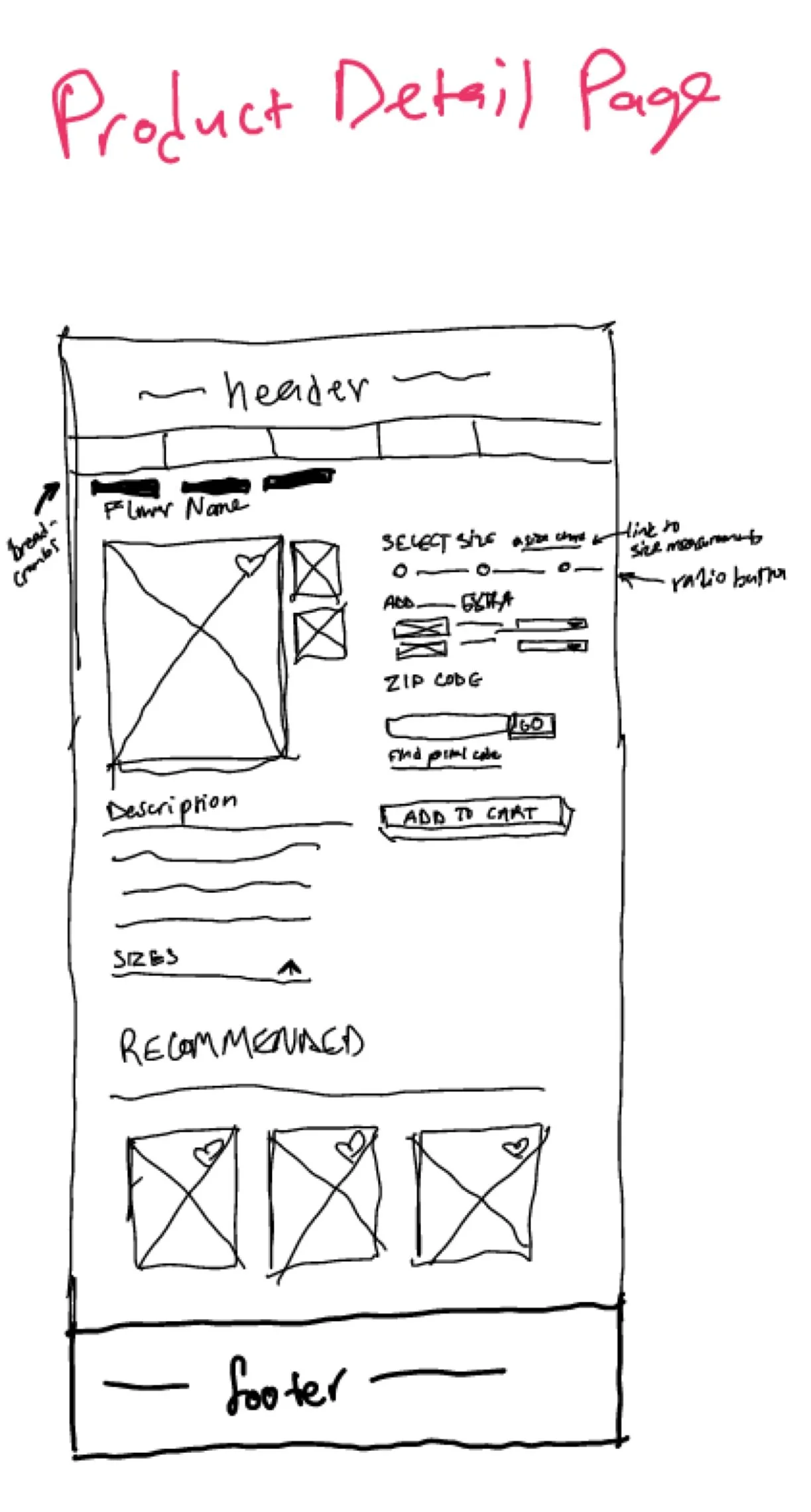
Low Fidelity Wireframes
Located below are the wireframes of the main flow. Inspiration was taken from the websites of local flower shop competitors. Within the design of these wireframes, ease of navigability and emphasis on relevant information, such as the “Our Services” and testimonials elements are placed at a high priority.
Homepage
Category Page
Product Detail Page
Shopping Cart
Checkout: Delivery Information
Checkout: Billing Information
Checkout: Confirmation
About Us Page
FAQ Page
UI Design
Logo and Branding
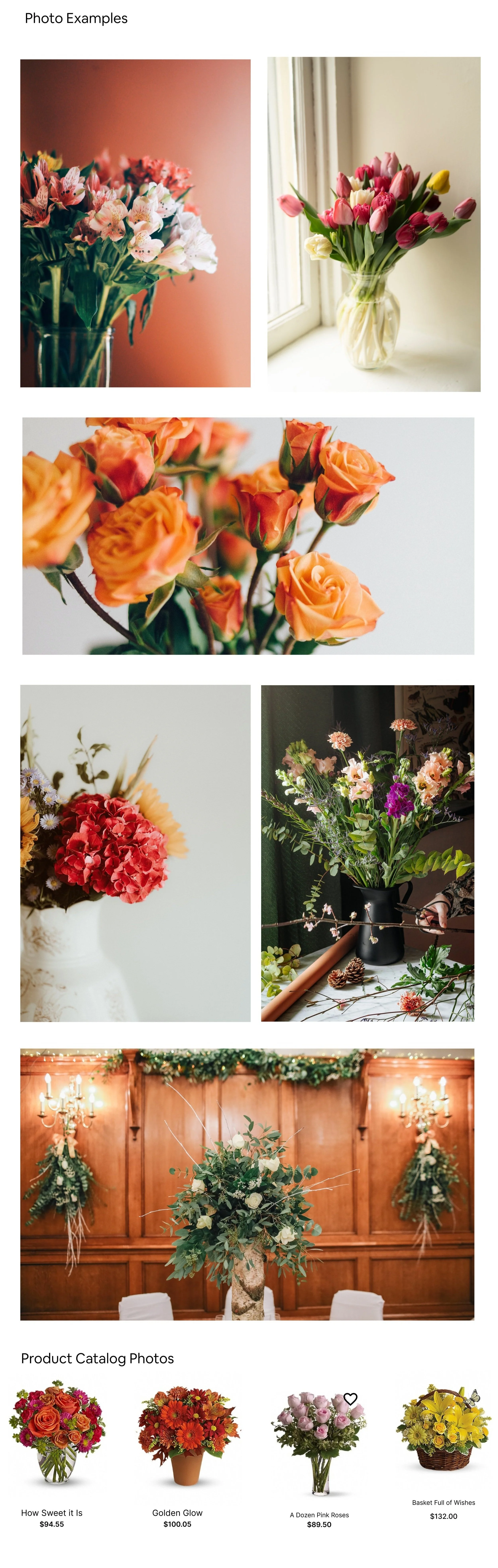
The Flower Exchange website’s initial look had an aesthetic that did not correlate well with its own personality. While putting together the mood boards and style tile, I crafted the visuals around a friendly and personable brand, by using a calm green for the navigation bar and accompanying warm colors throughout the design.

UI Kit
Moodboard
Iteration and Implementation
During this phase of research, 3 participants tested the usability of the interactive high-fidelity prototype and gave feedback. Findings were recorded and iterations were made based on that data.
Usability Findings
Usability tests were completed in person with participants navigating through the prototype on the Figma mobile app. I recorded our session through voice memos and took handwritten notes.
2 Participants within the 50-60 y/o age range and 1 participant within the 18-24 y/o age range.
Each test took about 30 mins.
All participants were able to navigate their way through the site with ease.
Participants agreed that overall design adjustments could be made for a cleaner look.
There were some suggestions about improving the flow of the product page to the shopping cart.
There were suggestions that the information included on the About Us and FAQ pages could be moved elsewhere in order to reduce the overcrowded look.
One participant suggested that important information, like the delivery and substitution policies, could be in several locations throughout the site.
Affinity Map
An affinity map was made based off of the results collected from the usability tests.
Hi-Fi Mockups
Conclusion
Next Steps
Make adjustments
I would make further adjustments based off of user testing results and user feedback. This would include rearranging the information on the About Us and FAQ pages, cleaning up the UI, fine-tuning the flow (specifically from the shopping cart screen to the checkout screen), and adding more credit-card checkout options.
Create another prototype
I would a more extensive high-fidelity interactive prototype that has multiple flows. This would involve adding more extensive amount of products within the category pages as well as adding animations to make the prototype more realistic.
Continue user testing
I would test the newer prototype and make any other necessary adjustments.