Mirror
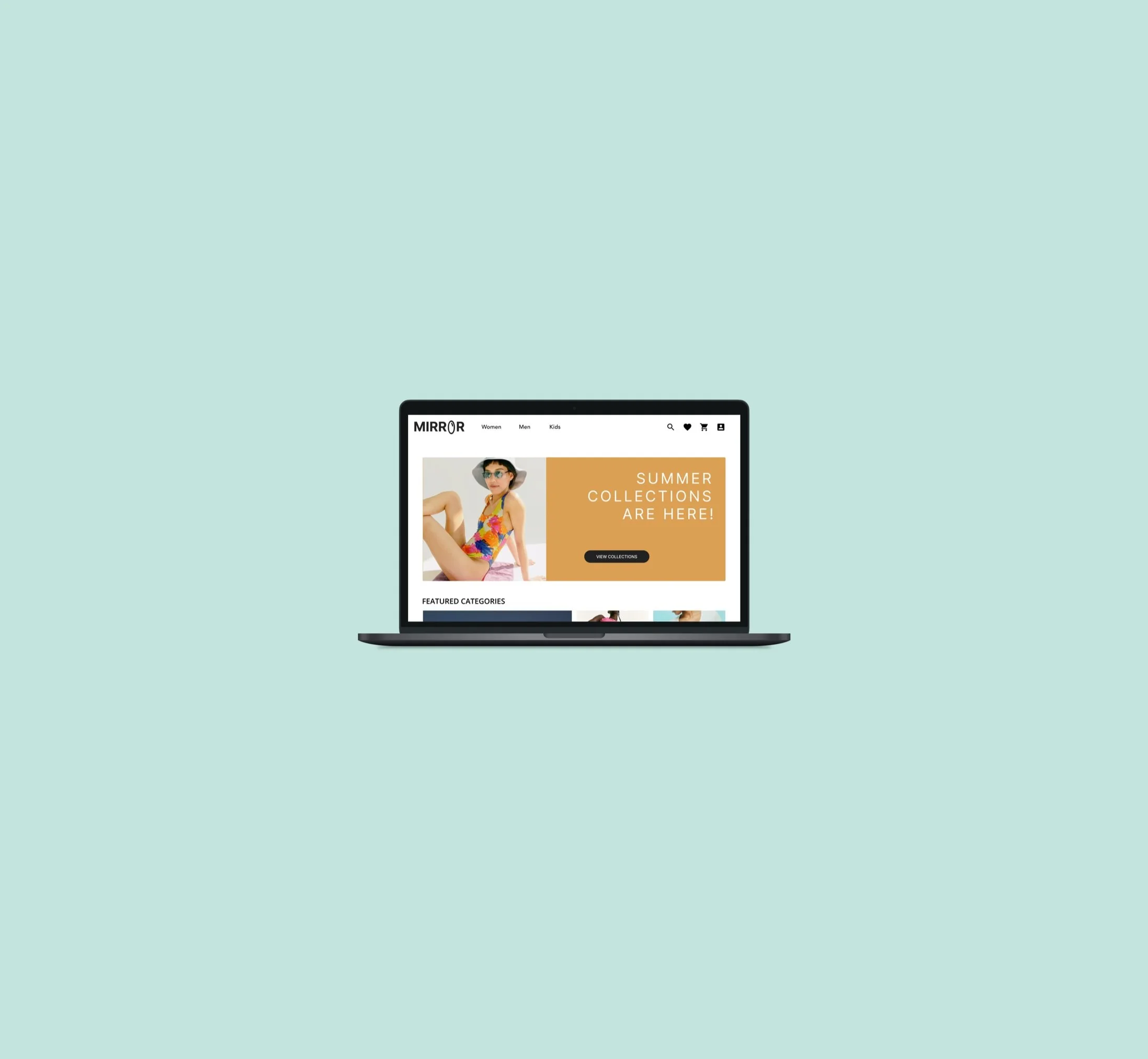
An affordable fashion retailer gets their website revamped along with a new logo.
Project Overview
My contribution
Process Overview
Details
Project Type - UI/UX Design
Role - End-to-end Designer
Client - Student Project
Tools - Figma, OptimalSort, Miro, Whimsical
Mirror, a fictional company, is a globally successful clothing store. The company never adapted to a widespread shift to online commerce, instead only conducting sales within their brick-and-mortar locations. Without an eCommerce site, Mirror was losing potential sales from customers, many of whom felt the need to seek out an online store to order clothes whenever the correct size wasn’t available in-store.
As the only designer on this project, I had complete control over every aspect from start to finish. The final prototype is the product of many iterations after receiving suggestions from my mentor and peers during group critiques. With this project, my goal was to essentially understand what Mirror’s target audience was looking for in a website and how I could best cater to their needs through not only the look and feel but the structure of the website. With that in mind, I was able to create a responsive website and logo for Mirror.
Research
Competitive Analysis
User Interview
Persona
Information Architecture
Card sort
Site map
Interaction Design
Task Flow and User Flow
Responsive Wireframe
Sketches
Low-Fi wireframes
UI Design
Branding
UI Design
UI Kit
Iteration and Implementation
Hi-Fi prototype
Usability findings
Affinity map
Research
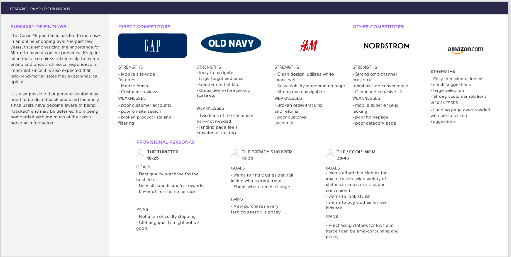
Competitive Analysis
User Interview
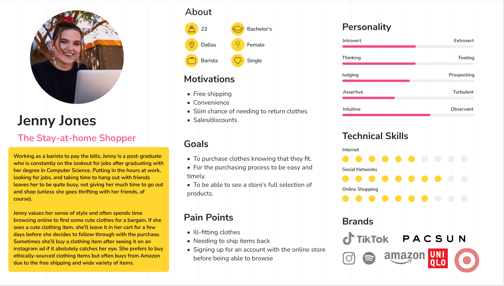
Persona
Within this phase, my goals were to…
Observe competitors and their strengths and weaknesses.
Understand customers' online shopping habits and preferences.
Narrow down Mirror's target audience and their expectations for the website.
Findings:
Some strengths that Mirror’s competitors have include having landing pages that are easy to navigate. Ease of use of the main navigation is key.
Clean and cohesive UI was also favored.
Personalization/personalized suggestions can benefit the shopping experience but overcrowding can do the opposite.
Having a strong omnichannel presence and placing focus on UX processes relating to orders and delivery is important.
Needs
Importance of seeing a store’s full selection of items
Easy and timely ordering process
Make sure that the clothes will fit well before purchasing.
In order to better understand customers’ online shopping habits and preferences, I conducted 4 user interviews in which I asked the participants about their thoughts on their eCommerce experiences. 3 of these interviews were conducted over zoom while the other was done in person.
Frustrations
Signing up for an account to buy something is annoying.
Frustration with having to return items if they dont fit.
Frustration with accidentally ordering the wrong size of an item to the description not being clear enough.
Motivations
Free shipping is popular.
If there’s a sale going on, a stronger inclination to purchase
More inclined to order online is returning clothes is easy
A user persona was created to gain a cohesive understanding of Mirror’s target audience. based on the most common insights that were made from the 4 previous 1-on1 interviews.
Information Architecture
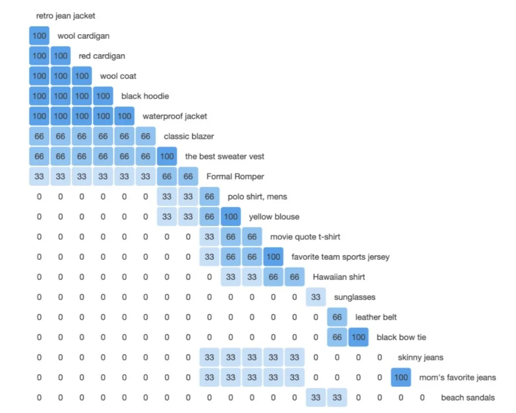
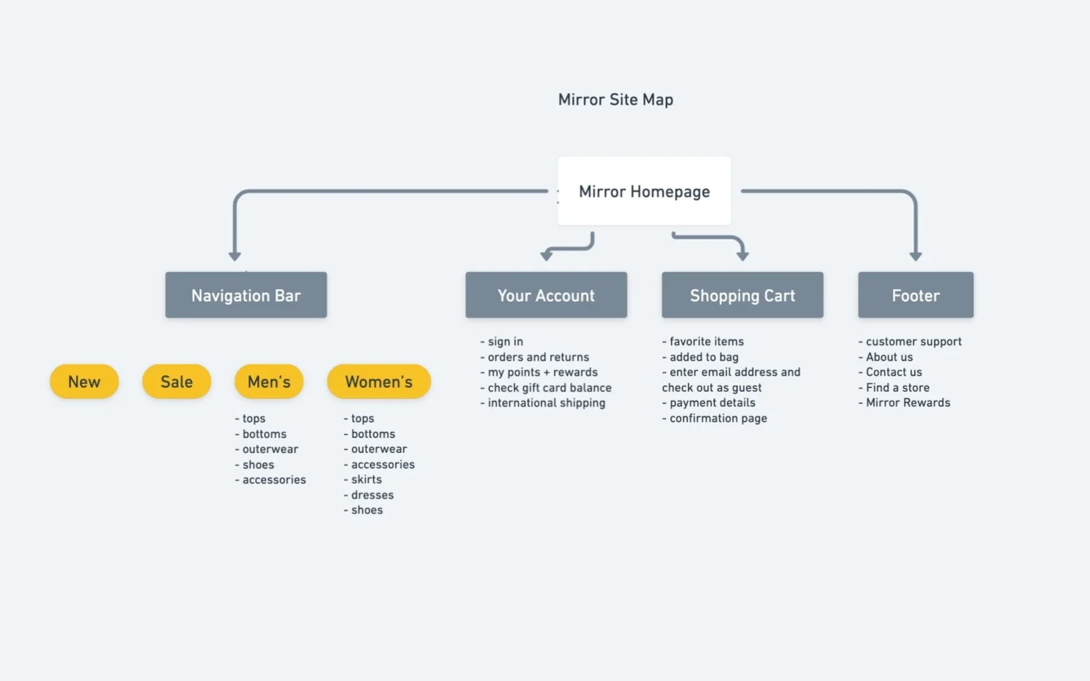
During this phase of research, card sorting tests were sent to 3 subjects to determine how to best sort information within the website, specifically for the navigation bar. These card-sorting tests were conducted using the OptimalSort Card Sorting program. After that, a site map was created based on that data.
Card Sorting
3/3 of participants grouped retro jean jacket, wool cardigan, red cardigan, wool coat, black hoodie, and waterproof jacket together.
3/3 grouped classic blazer and the best sweater vest together.
3/3 grouped mens polo shirt and yellow blouse together.
3/3 of participants grouped movie quote t-shirt and favorite team sports jersey together.
3/3 grouped the leather belt and black bow tie together.
3/3 grouped skinny jeans and mom’s favorite jeans together.
2/3 participants also created categories for shirts, pants, and shoes.
Site Map
A site map was created from the categories that were defined in the card sorting tests.
Interaction Design
Task Flow
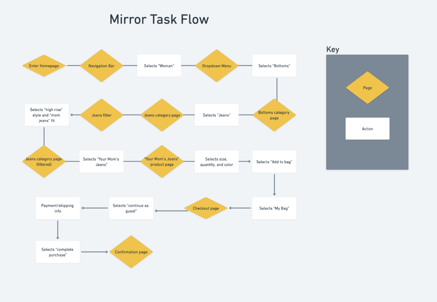
A task flow was created to understand how a user may use the website to accomplish a task. This task flow illustrates the actions a customer would potentially take to purchase a pair of mom jeans.
User Flow
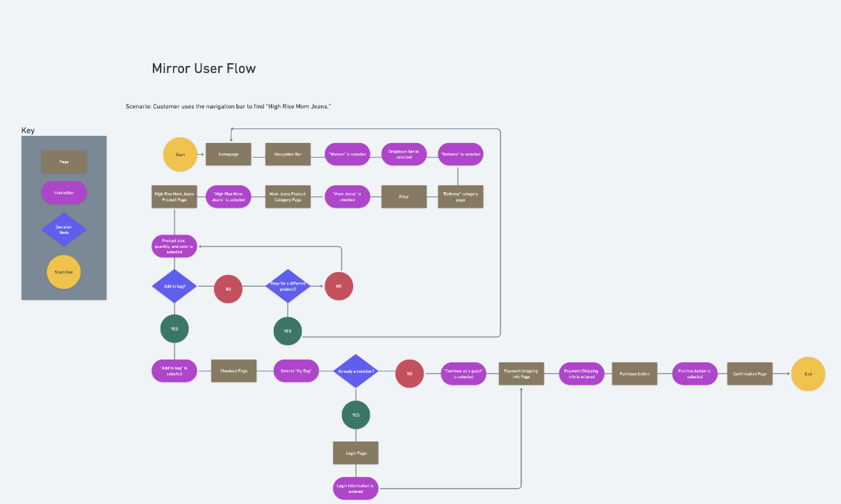
A user flow was created so that I could map out how a user would complete tasks on the website and so that I could ensure that the website’s flow is simple
Sketches
Low Fidelity Wireframes
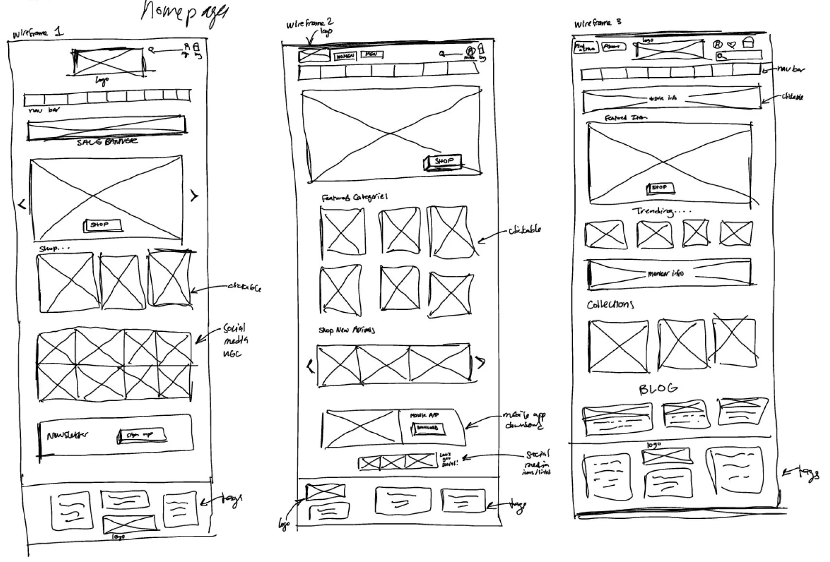
In these homepage sketches, I experimented with different layouts to best determine which information needed to be prioritized before I started digitizing the homepage
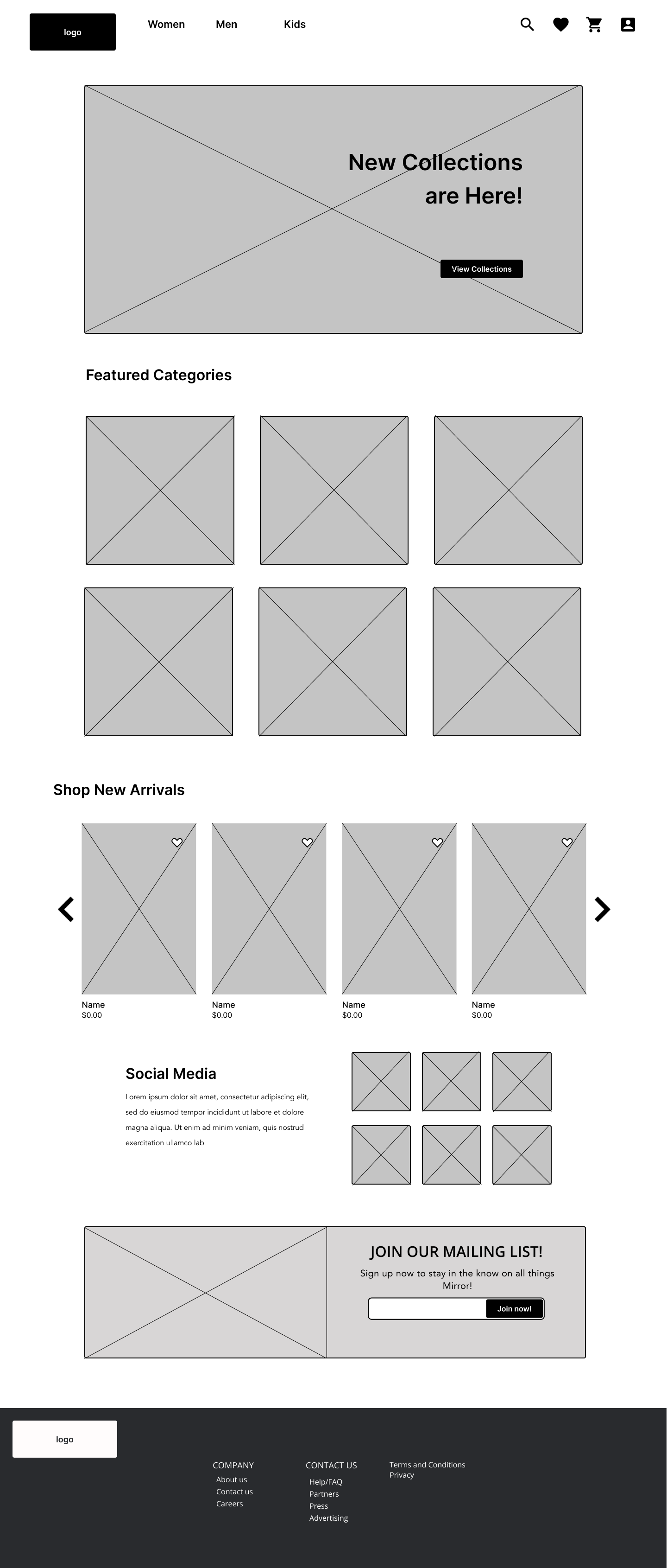
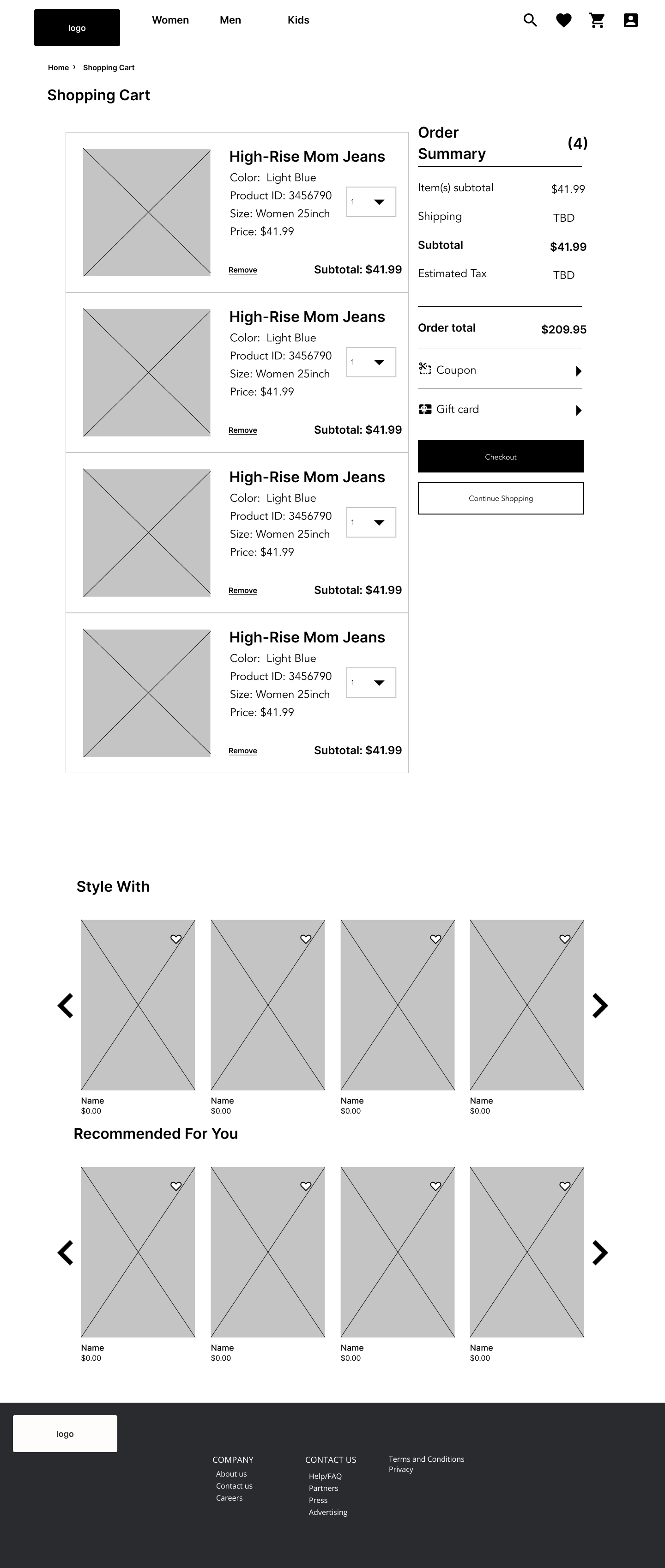
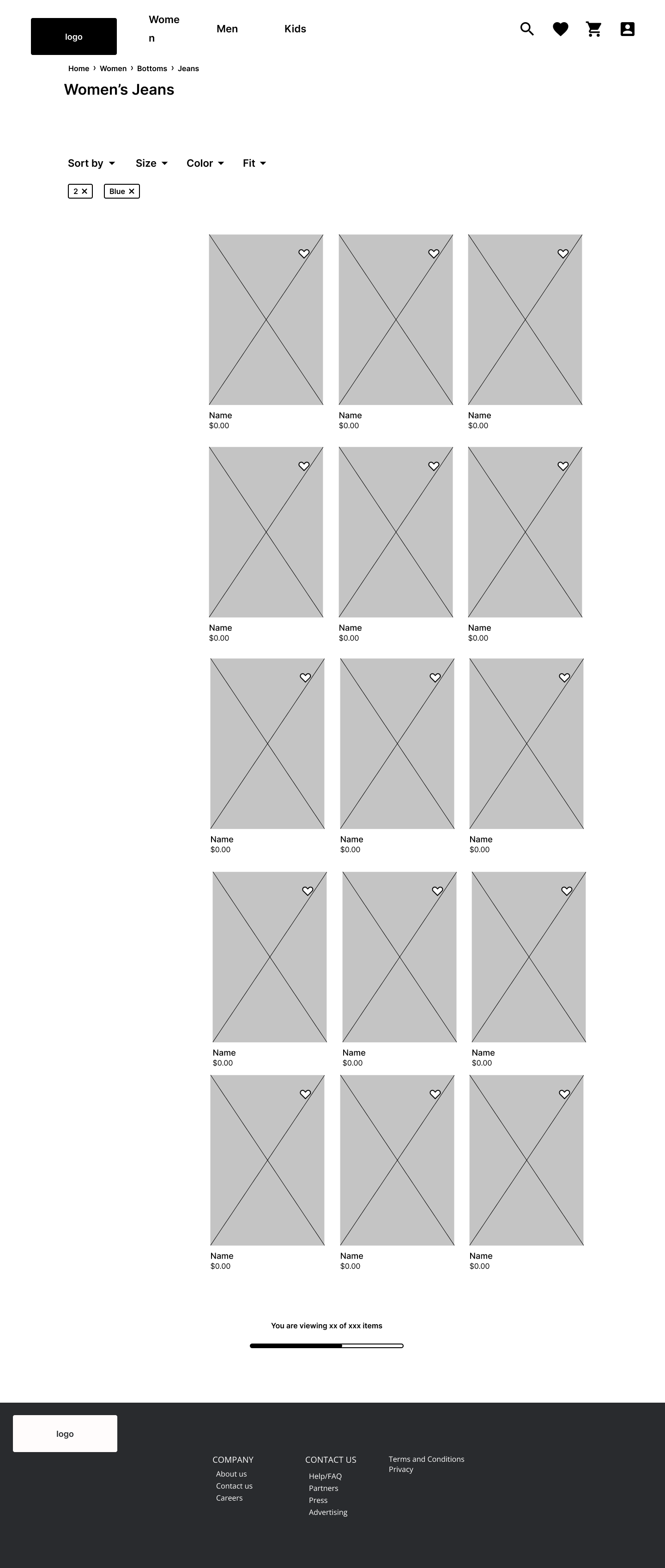
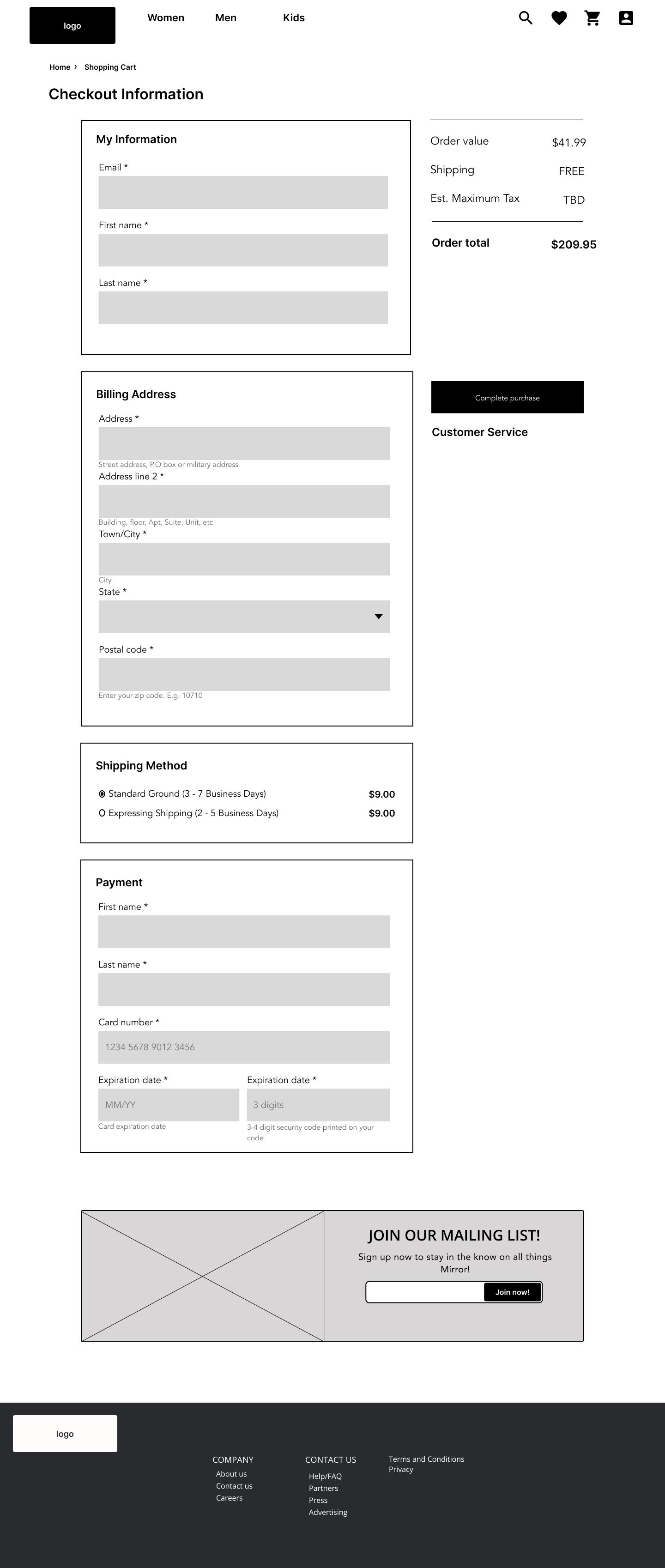
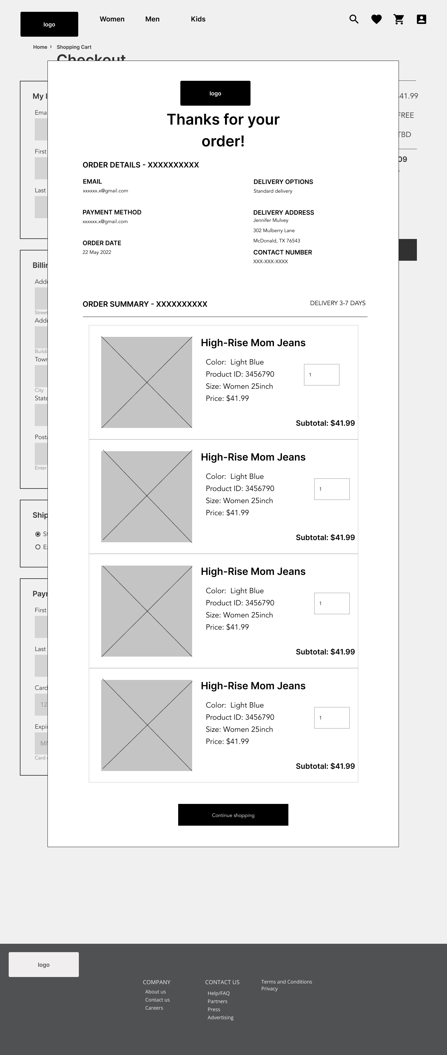
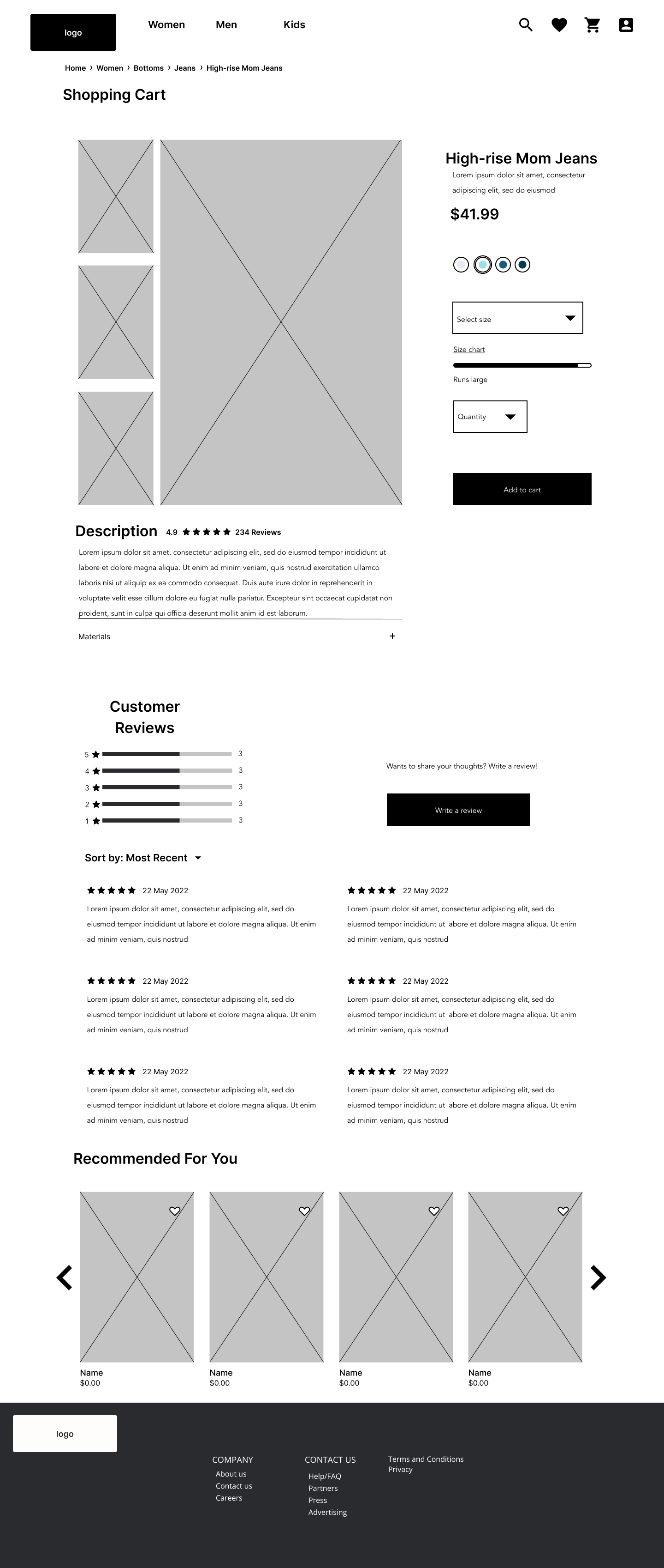
Located to the right are responsive wireframes of the homepage. Below are the rest of the desktop wireframes of the main flow.
Homepage - Desktop
iPad
iPhone
Category Page
Product Page
Shopping Cart Page
Checkout Page
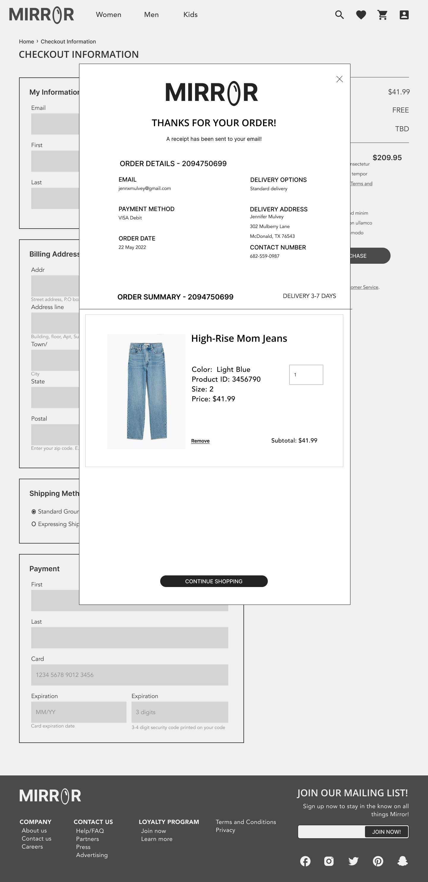
Confirmation Page
UI Design
UI Kit
Logo and Branding
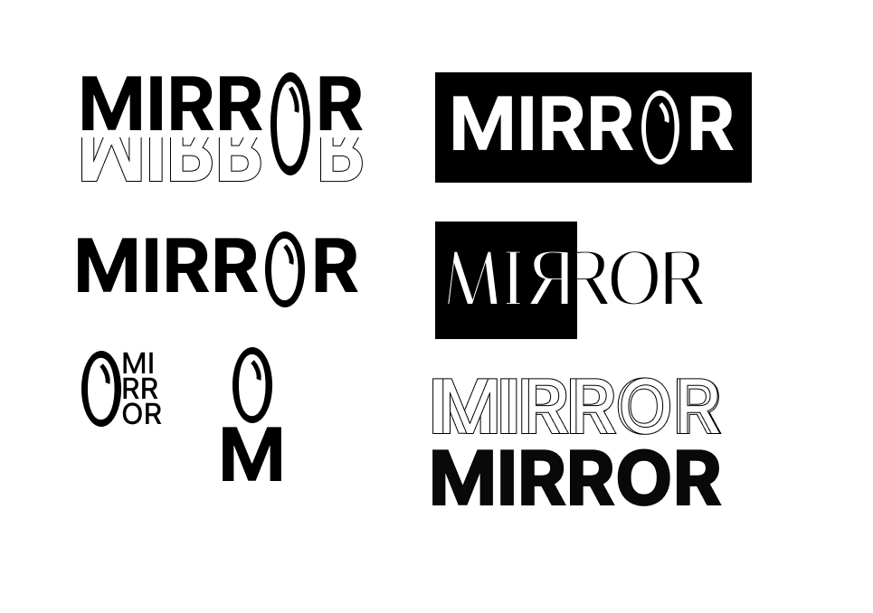
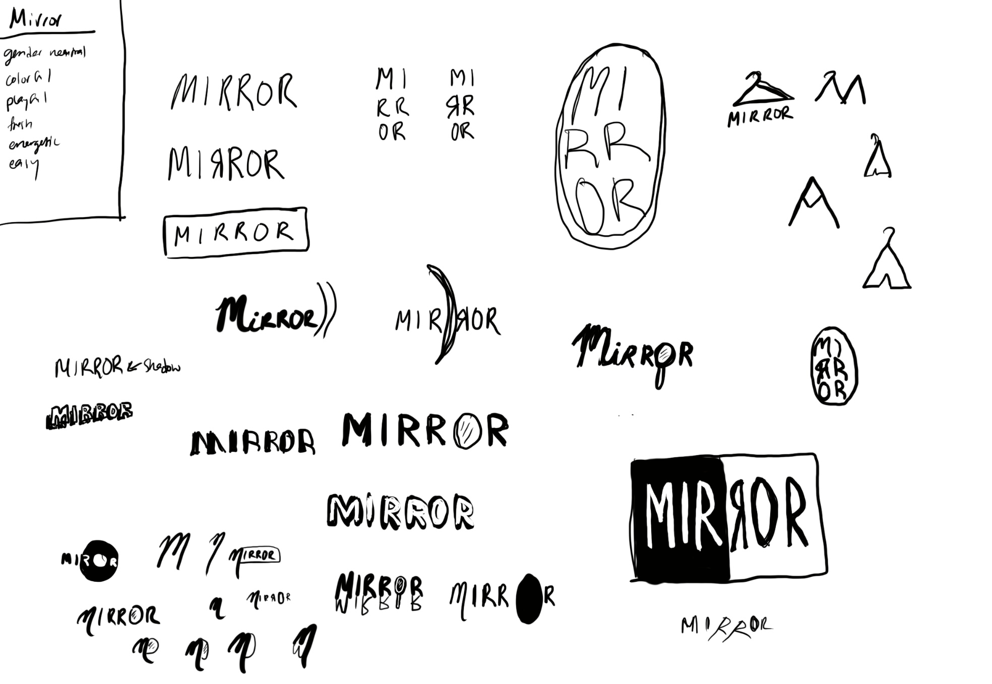
Since Mirror had an outdated logo, I was tasked with providing the company a new one that reflected the new look of their website. My goal was to create a logo that could be perceived as both modern and playful for the site.
Logo sketches
Early logo iterations
Final Mirror Logos
UI Inspiration
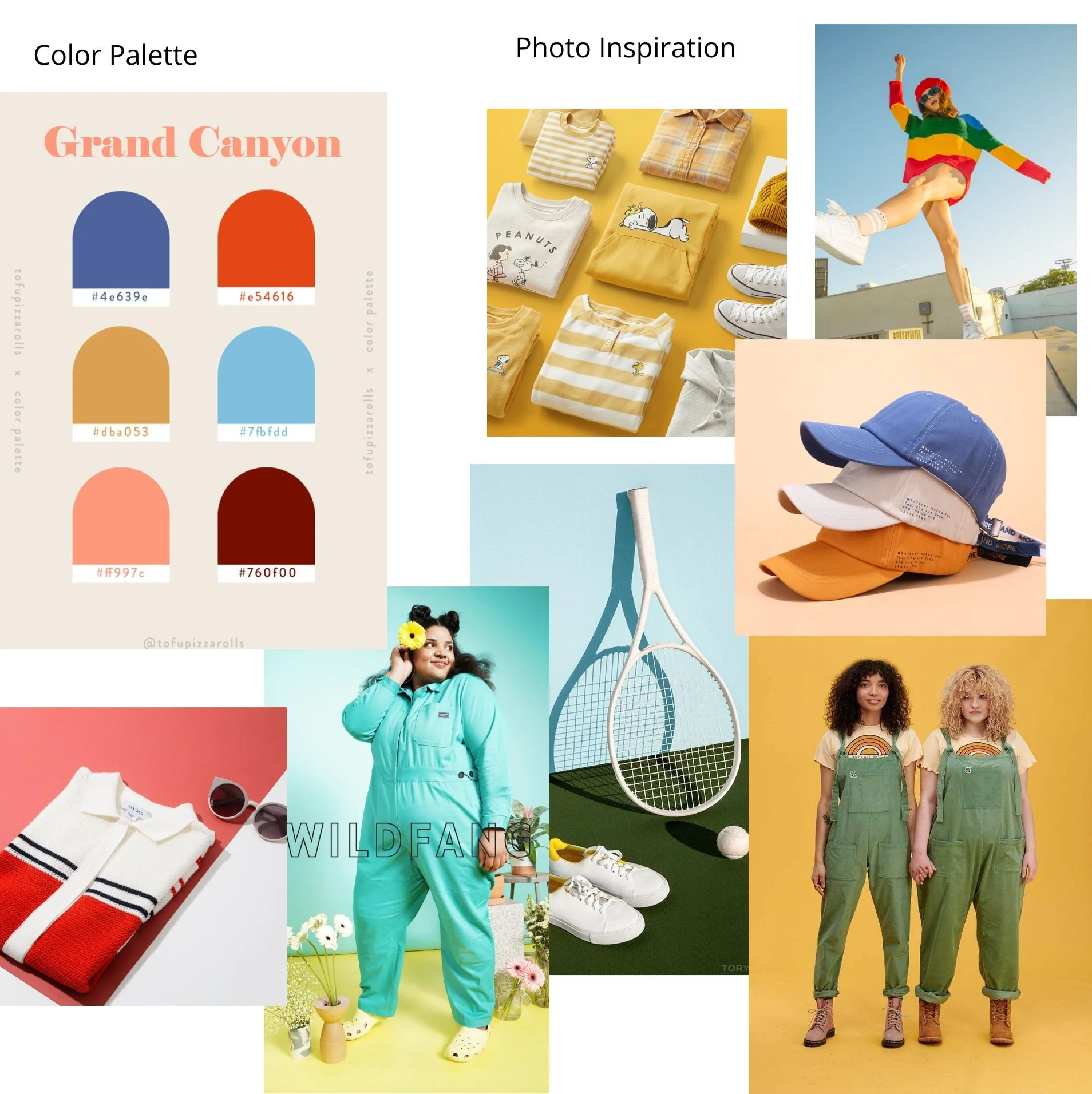
Color Palette & Photo Inspiration
Iteration and Implementation
During this phase of research, 3 participants tested the usability of the interactive high-fidelity prototype and gave feedback. Findings were recorded and iterations were made based on that data.
Hi-Fi Prototype
Usability Findings
Affinity Map
Usability tests were completed in person with both of us on my laptop. I recorded our session through voice memos.
3 Participants within the 50-60 y/o age range
Each test took about 30 mins.
All participants were able to navigate their way through the site with ease.
The navigation and dropdown menus seemed preferable by a long shot over using the search function.
All participants thought that the style quiz would be helpful in finding the pair of jeans that works for them.
Participants gave suggestions concerning the UI, mainly on the checkout and confirmation pages.
An affinity map was made based off of the results collected from the usability tests.
Conclusion
Next Steps
Make adjustments
I would make further adjustments based off of user testing results and user feedback. This would include adding more credit-card checkout options, creating a fully functional Denim Fit quiz, and adjusting any confusing copy.
Create another prototype
I would a more extensive high-fidelity interactive prototype that has multiple flows and includes a Denim Fit quiz.
Continue user testing
I would test the newer prototype and make any other necessary adjustments.

